Introduction
Data visualisation helps us better understand the information and statistics our systems have collected. Having different views of the data, in different types of charts, like line charts, bar charts, pies etc, is really useful for anyone who has to make decisions based on data. Since users expect to have everything now on their mobile devices, we will see in this post how we can draw such charts. We will create three different types of visualisations, the first two with the awesome Charts library, and the third one will be our custom implementation.
Charts
The Charts library makes drawing charts really easy. It has many different types of charts, which can be customised based on the developer’s needs. The charts are responsive on different screen sizes. Also, you can interact with the charts, zoom in, select different sections and similar. More details about the library on their GitHub repo.
The first chart that we will create would be a line chart, commonly used for representing data over certain period of time.

We will add Charts as a CocoaPod, so first, create a Podfile, with the following contents and run “pod install” at the root of your project:
platform :ios, :deployment_target => '10.0'

source 'https://github.com/CocoaPods/Specs.git'

target 'ChartsDemo' do

use_frameworks!

pod 'Charts', '3.0.4'

end
Next, create a tab based iOS application with three view controllers: LineViewController, CombinedViewController and CustomViewController. These controllers will represent the three different types of charts.

In the LineViewController, in the Storyboard, add a new subview of the main view and set its class to be LineChartView (from the Charts library). The LineChartView, as its name implies, can be used to draw line charts. Also add an outlet in the LineViewController, so we have a reference to the chart view in code. Let’s see what we need to implement in this view controller.
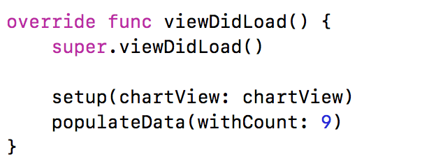
There are two important methods that we call in the viewDidLoad method. In the setup method, we are configuring the chart view. As you can see from the method below, we are setting dragging and scaling enabled. We don’t want grid background for this chart, nor an x-axis and right axis, so we are disabling those two. One note on the axis, in the library, there is one xAxis, which is horizontal, and two y-axis (left and right). We are using only the left axis in this chart and we are setting the minimum and maximum values to be in the range of 50 to 90. You can play around with these properties and customise the chart per your requirements.

Next, let’s create the data that will be displayed in this chart. We will create 9 random values, from the provided min and max values and create ChartDataEntry objects. This array of objects would then be used to create LineChartDataSet. This will represent our curve displayed in the chart. We will label the set with the string “Precipitation”. You can customise the set with several different values, such as mode, cubic intensity, line width, circle radius, colour etc. You can also change those values, to customise the chart.

With the set, we are creating LineChartData object and we are setting this data to the chart view. And that’s everything we need to do to have a line chart in our project. Run the app and check the created chart.
Next, let’s create a more advanced bar chart. This chart will contain data in several years, of different types. The types will be distinguished between themselves with different colours. The total in a year would be visible in the chart as well, by combining the values of the different types. This is handy in places where you have to calculate the total revenue of different departments of a company, while still having the information of the revenues per department. We will do this chart with the Charts library.

In the CombinedViewController in the storyboard, add a BarChartView as a subview of the main view and also set an outlet in the controller. Similarly to the line chart, we will setup the view and populate its data, in the viewDidLoad method.
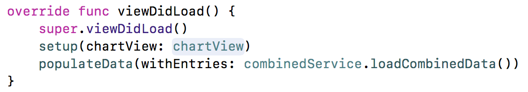
The setup method has similar customisations to the chart view, as the line view. One new thing here is the valueFormatter of the xAxis. This is used to provide custom values of the x-axis (years in this case).

The YearValueFormatter is our custom class, that has to implement IAxisValueFormatter protocol defined in the Charts library. We basically need to implement one method, which tells the chart view which string to display for the given entry of the chart view.

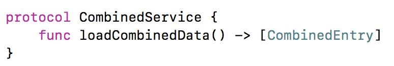
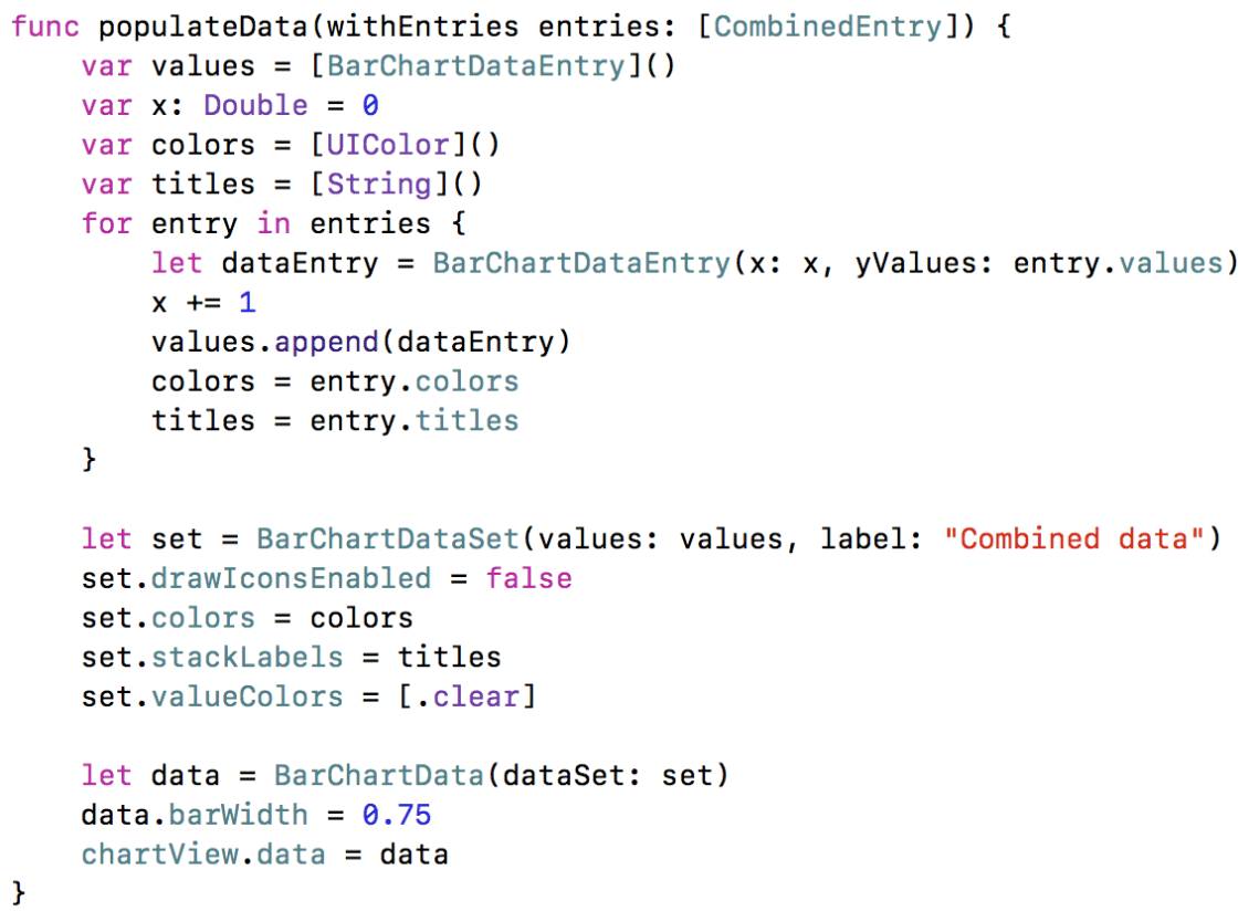
Now, let’s see how we can populate the data in this chart view. Let’s first define a protocol, what a method that loads the data that will be presented in this chart.
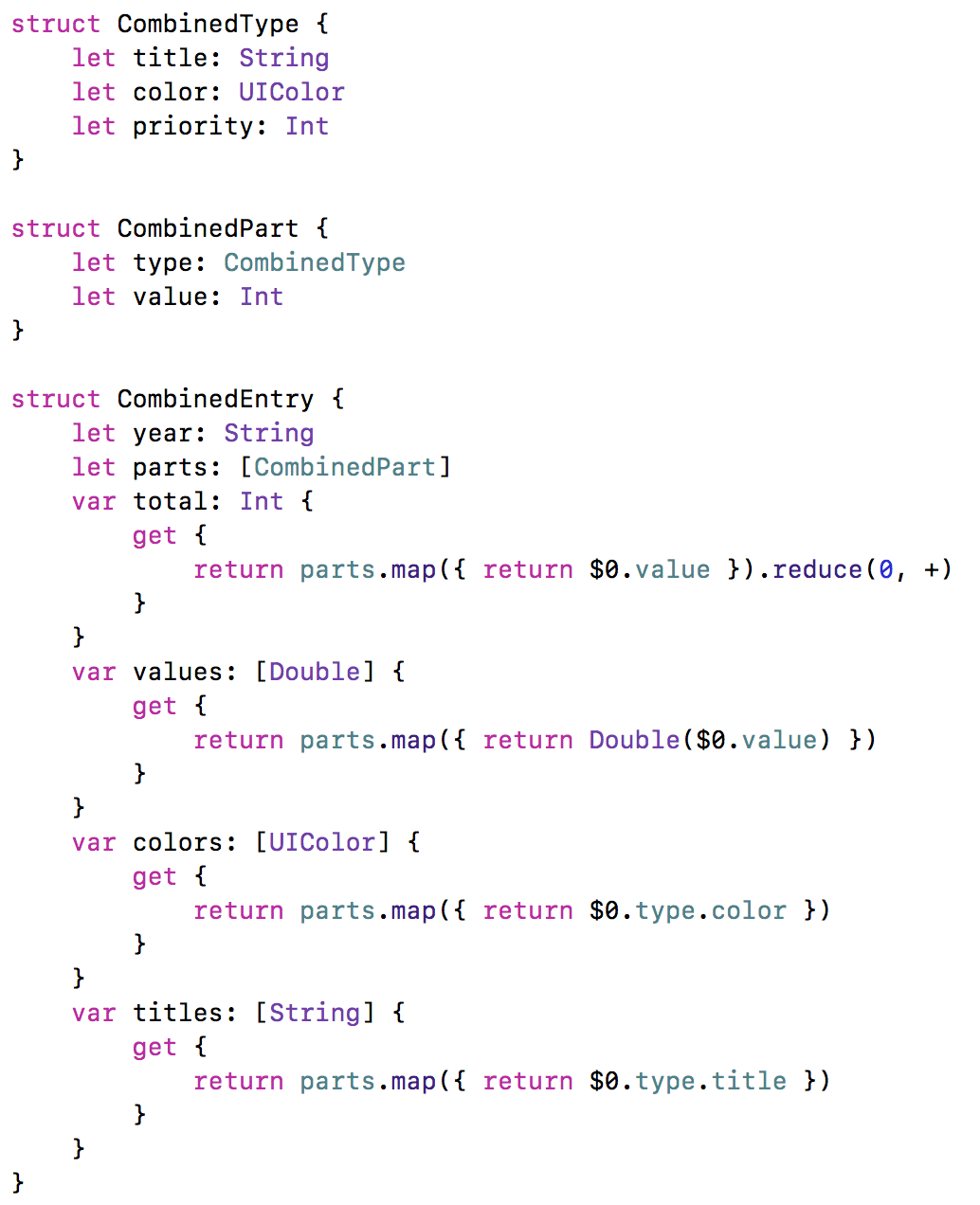
The CombinedEntry type will represent entry in a year. It will contain information about the year, the parts which will consist the entry (CombinedPart), as well as computed values, for the total value for that year, as well as the colours and the titles of the parts. One CombinedPart struct will represent one sub-section in the bar chart for a year. Apart from the value, it will also have a CombinedType struct, which contains information about the title of the type (for example the name of the department), the colour and the priority. The priority value will be used to arrange the sub-sections in the chart.
We will create a MockCombinedService implementation for the protocol we have defined, which will contain information for the years between 2012 – 2016. Check the example project for the mock values defined there.
After we have defined the data types we need to show the data in the chart, let’s now see how we can populate the data in it. We are passing the array of CombinedEntry elements created in the mock service to the populateData method. We will convert these elements to BarChartDataEntry objects, that the chart view expects to have. After we populate this data, similarly to the line chart view, we are creating a data set, this time of type BarChartDataSet. We are setting the colours and labels from the mock objects. Then, we are using this set to create a BarChartData, which is set to the chart view.
That’s everything we need to do to have a combined chart. You can check this by running the app at this step.
Custom chart
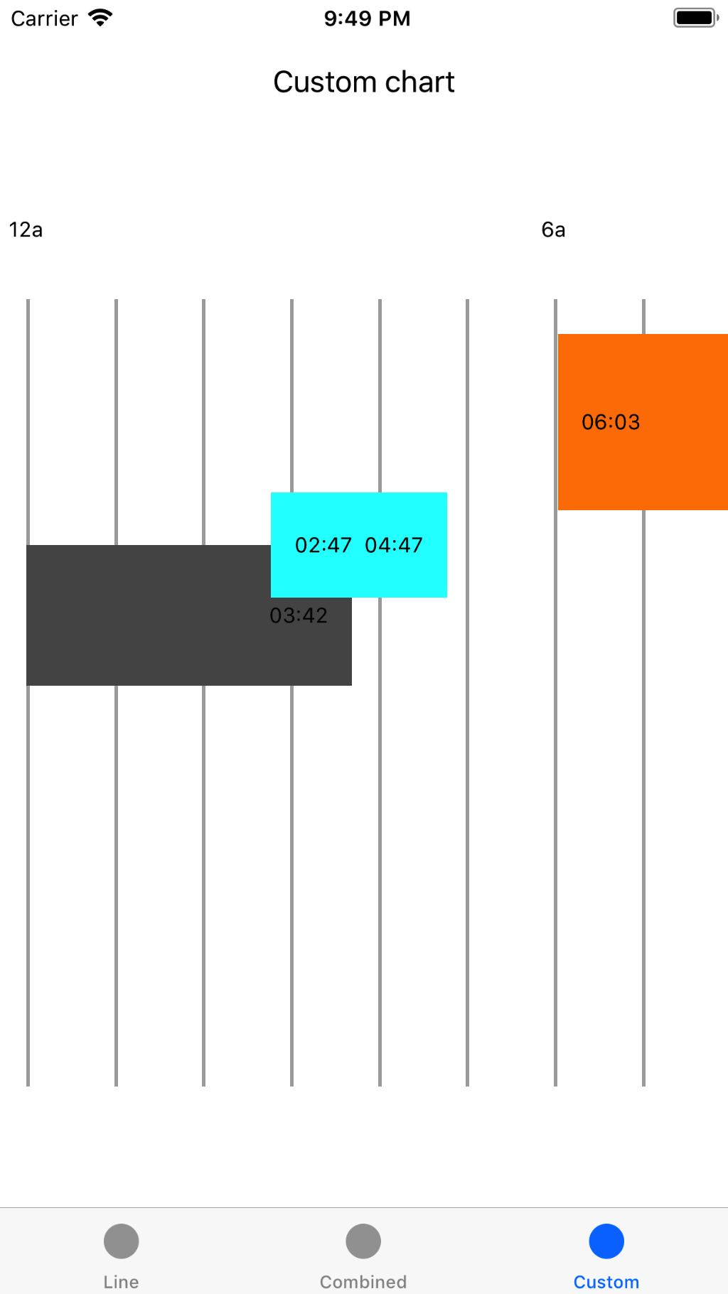
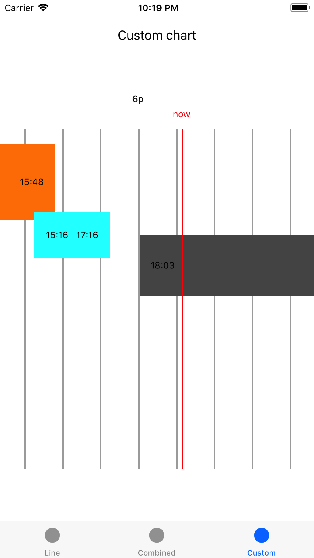
There are many types of charts that the library supports, but if you need something particularly custom, then you need to do this by yourself. For example, let’s say we need to show some data during the day, like time for sleep, time for going out and similar, in a horizontal scrollable chart.
We will do this, by drawing items dynamically in a scroll view. Create a CustomView (subclass of UIView) and add it as a subview of the main view in the CustomViewController. Also, create an outlet in the controller for this view. Add a scroll view as a subview to the custom view and define an outlet there.
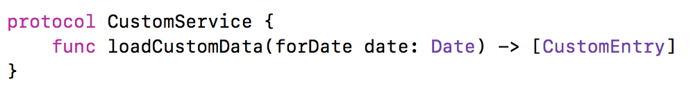
Before going into details of the CustomViewController, let’s first see which data structures and protocols we would need. Since we will be displaying mock data here as well, let’s make our live easier when we have to switch to real implementation, by defining a protocol.
The CustomEntry type will represent one entry in our custom chart. It will be defined by its type (CustomType), start/end time and whether it has start and end (this will be used in cases where the activity is transferred to the next day, like sleeping). The origin in the x-axis will be defined by the start time, while the width, by the difference between the end and start time. As mentioned, every entry will have its own type. The elements of the same type will be on the same place of the y-axis and will have the same title, height and colour.

In the sample project, there is a MockCustomService class, that returns some dummy data that we will present in our chart.
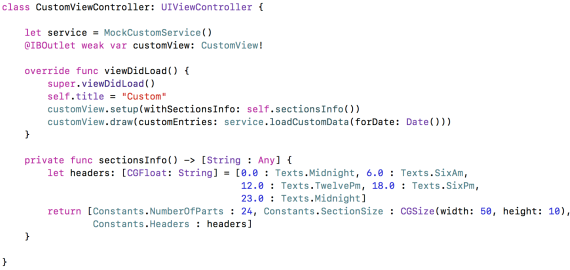
Now, let’s see the CustomView. Here we will do the drawing of the chart. First, we need to setup the view with all the labels that will give more information about the sections of the data (the time of the day).
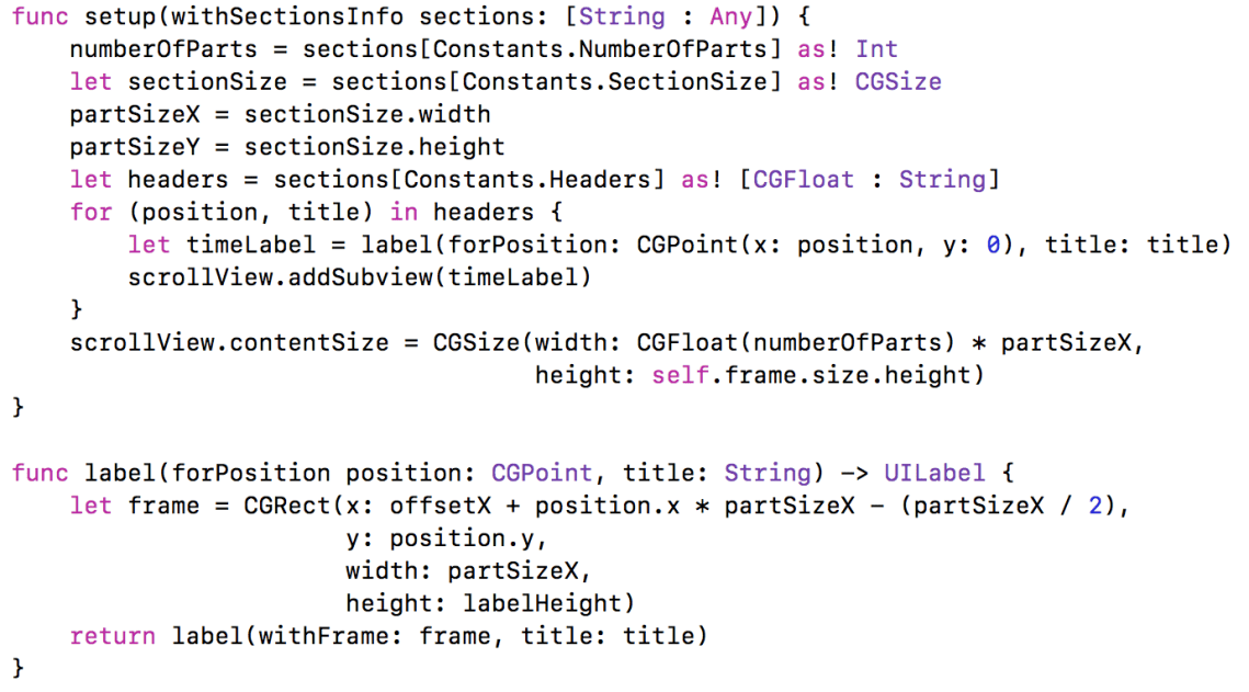
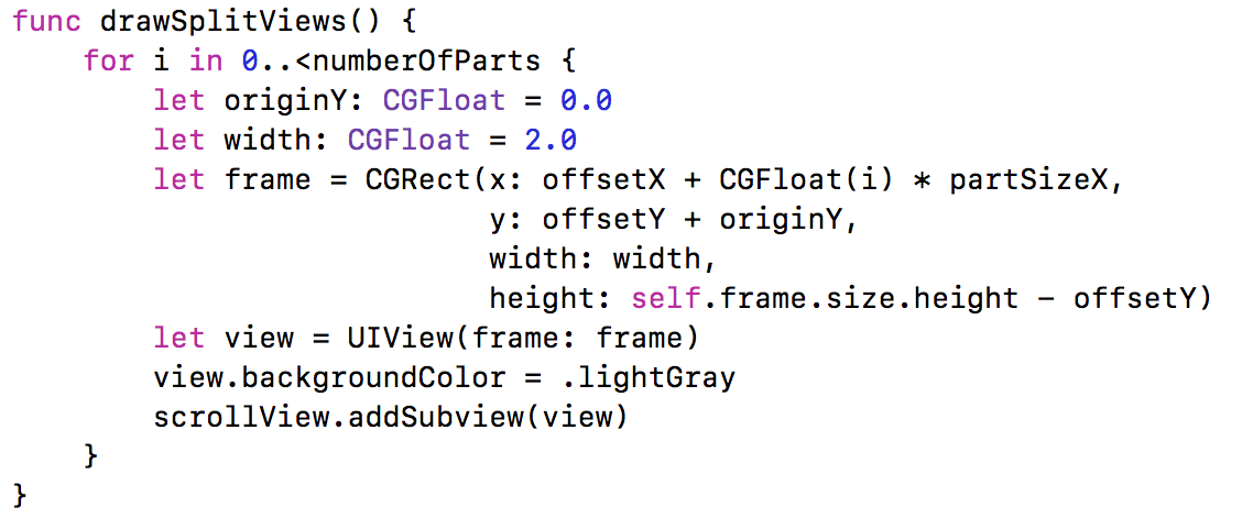
The actual drawing of the items will be in the draw(customEntries:) method. First, we are drawing the split views. Those are the vertical lines that split the different times of the day. We will see that method shortly. Then, we go through the entries provided by the custom service and we create views. The frames are calculated based on the information in the CustomEntry objects. If the entry has start, we also create a label that will show the start value at the beginning of the chart entry. We do the same thing with the end time. At the end, we are creating another vertical line, with different colour, which gives indication about the current time.

The drawSplitViews creates vertical lines that split the chart, depending on the number of parts the chart has (24 in our case, for the hours in the day).
The updateNowIndicator computes the current date and adds another vertical line that gives indication of the current time.

Then, in the CustomViewController, we only need to setup the view and populate the data that will be presented in the chart.
That’s everything we need to have our own chart. It’s a bit more coding than using a library, but you can customise this in any way you want.
Conclusion
In this post, we have created three different charts, the first two with the Charts library and the third one with our own custom implementation. You can find the source code of this post on my GitHub repo here.

Great post. Keep it up :).
LikeLiked by 1 person